purarva
purarva
Industry
Organic Activewear
Provided
Brand Idea
Brand Messaging
Logo Design
Visual Identity
Packaging Design
The Purest Form of Movement
Challgenge
In a market crowded with consolidated brands competing for the same attention, the challenge was clear. How do you make Purarva visually distinct enough to stand on its own without being overshadowed by the names that already own the space.
Purism
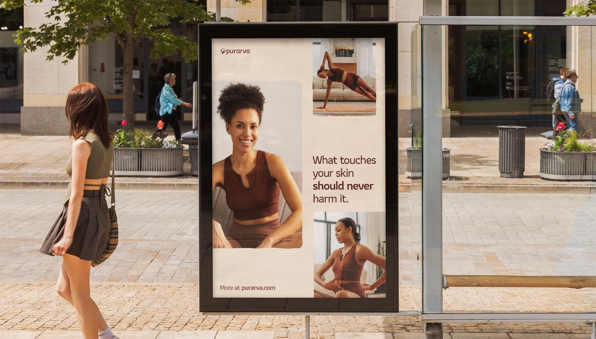
Every competing brand claims to be organic, skin safe and made for comfort. But withput actually showing like it The challenge was to build a brand that does not just say pure but feels pure across every touchpoint, from the logo to the packaging to the way a product photograph is framed. This led to defining the Purarva brand ism: Purism. The tagline has been wrote based on this idea and the brand mission, to craft the purest form of movement.

Brand Naming
Pure arva or purarva?
The first decision was whether the brand would be called ‘pure arva’ or ‘purarva’. Based on naming principles and strategic thinking, one word is more memorable, more compact, more ownable and more visually balanced. And in a brand built on purism, a single word is inherently purer than two.
Brand Logo
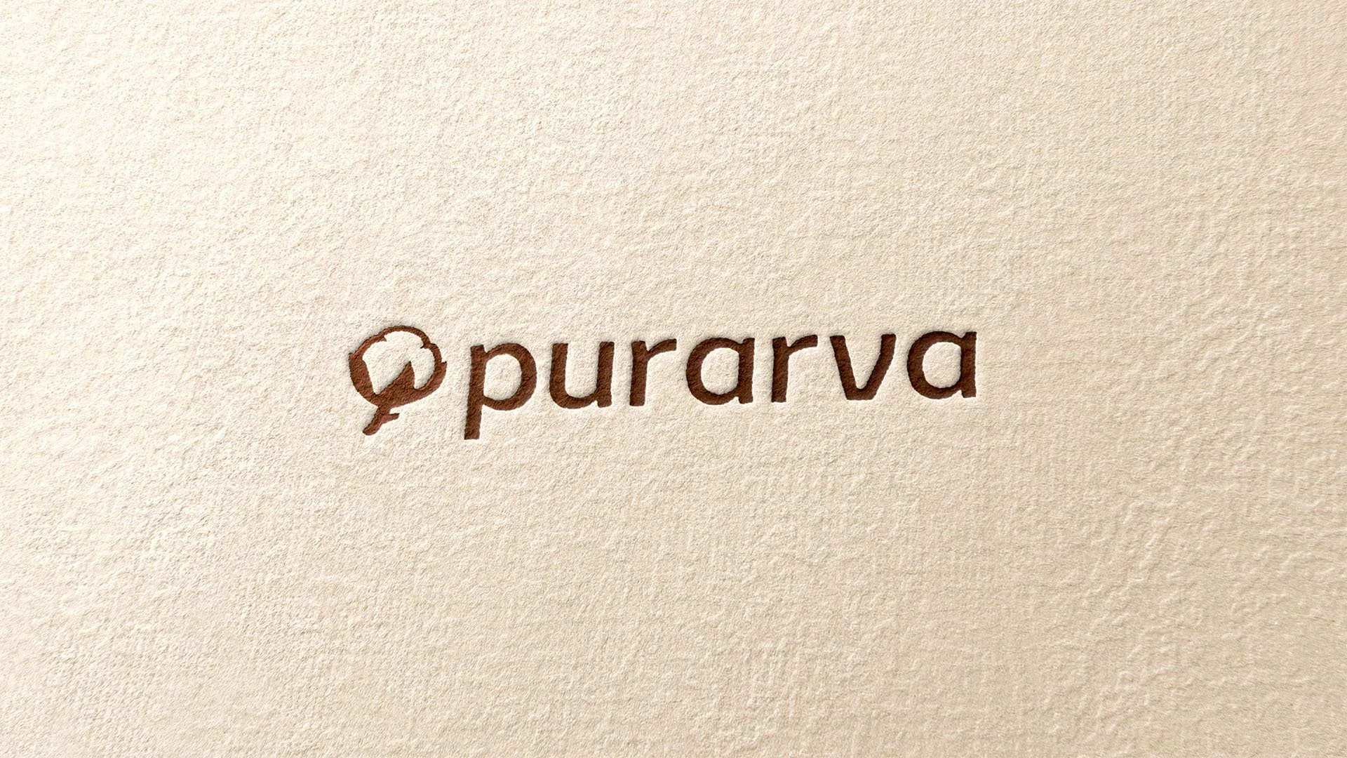
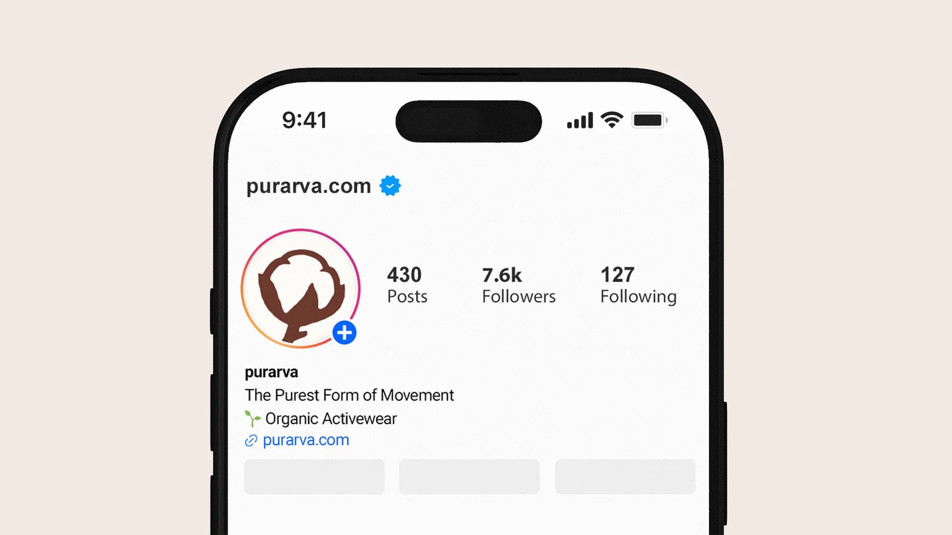
The brandmark draws from a cotton bulb , the most recognizable symbol of organic clothing.
The bulb construction is organic with soft edges to reinforce the organic character of the brand and its comfort.
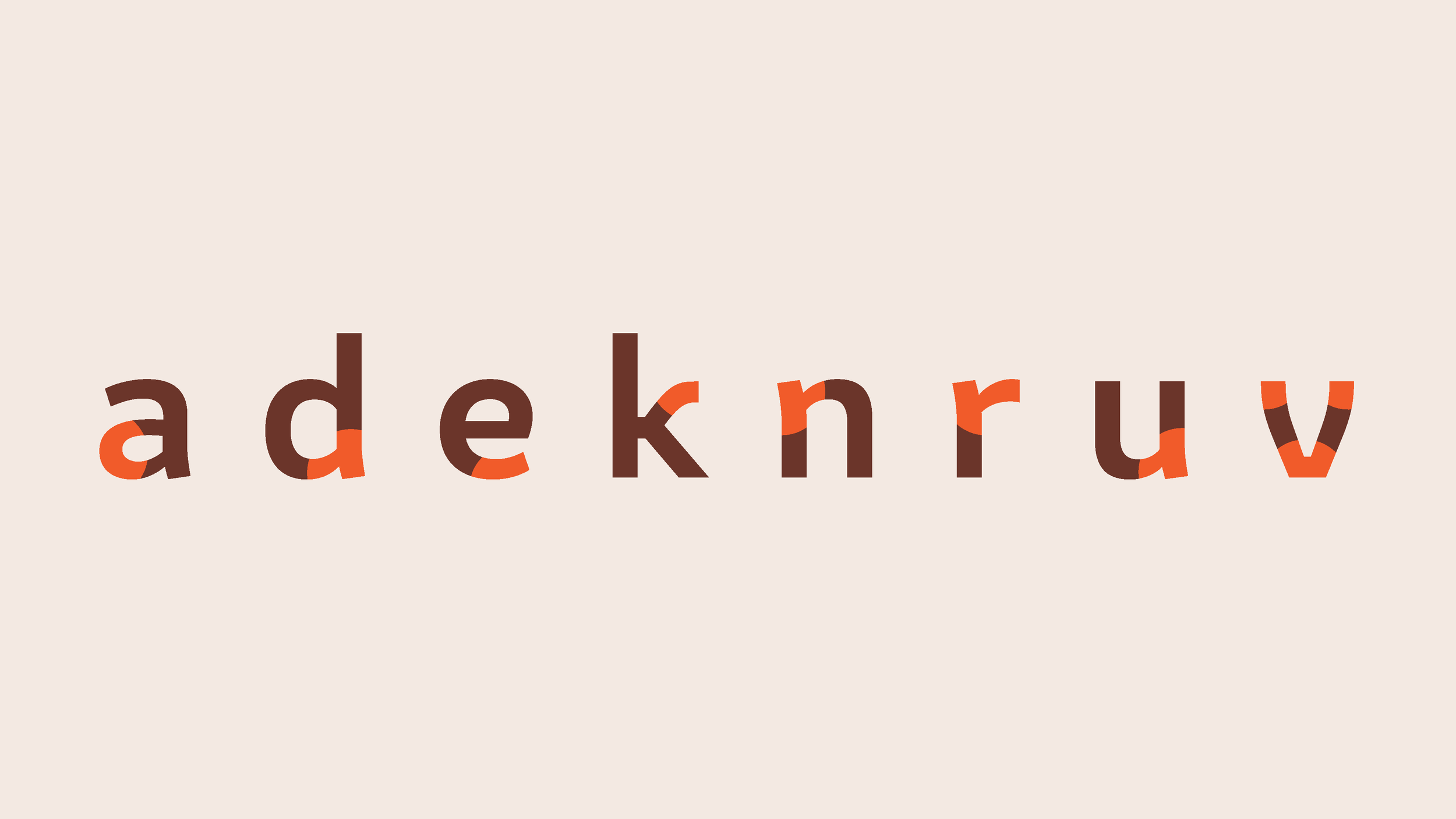
The wordmark is built on Amifer Typeface, a clean sans-serif whose structure subtly references roots. Lowercase letters bring a sense of calm and innocence. Generous letter spacing creates lightness and breathing room. The one-story "a" communicates simplicity and visual purity. The entire word carries a subtle organic treatment, with slightly irregular edges that reinforce the brand's natural character.

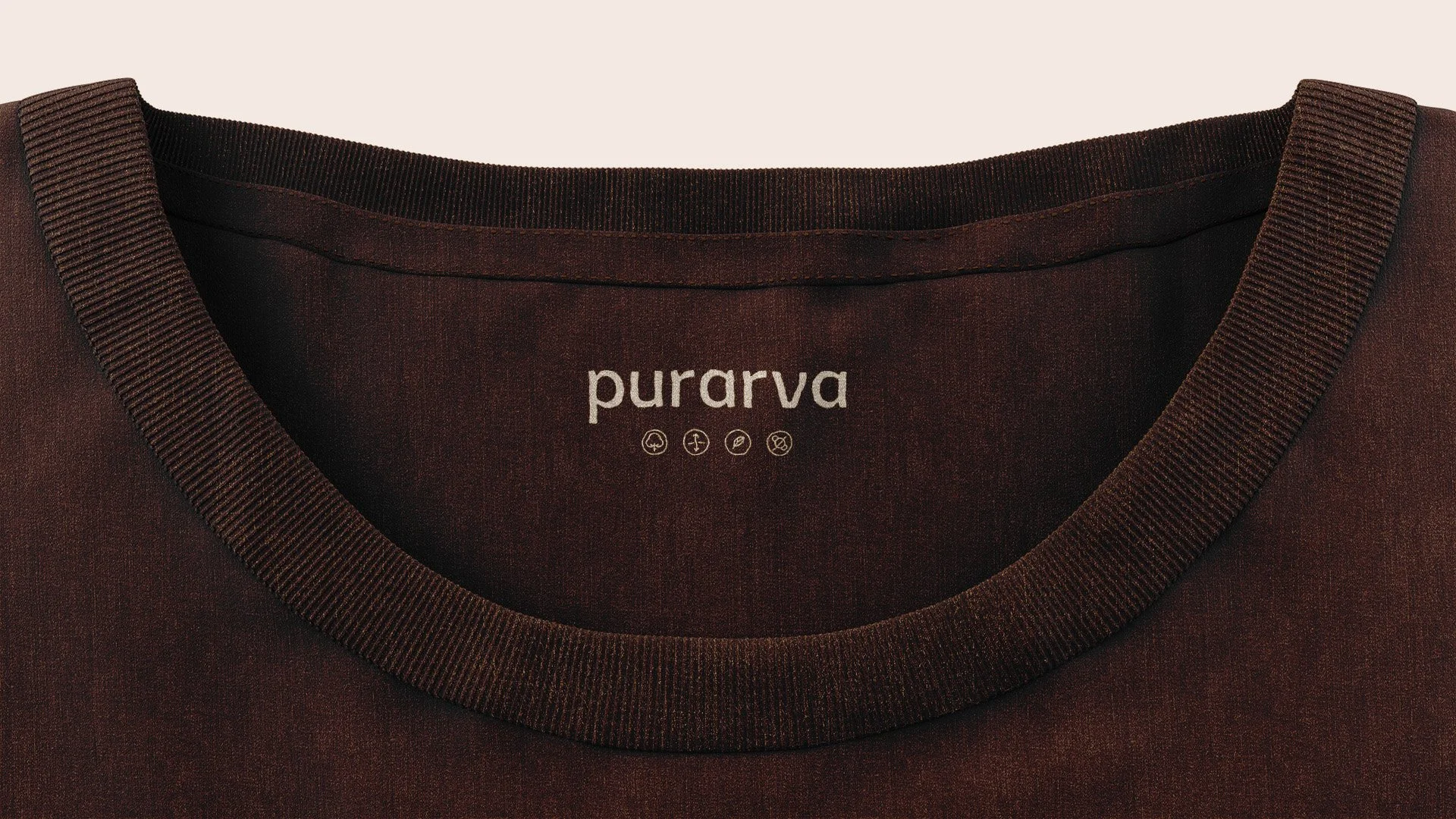
Visual System
Color
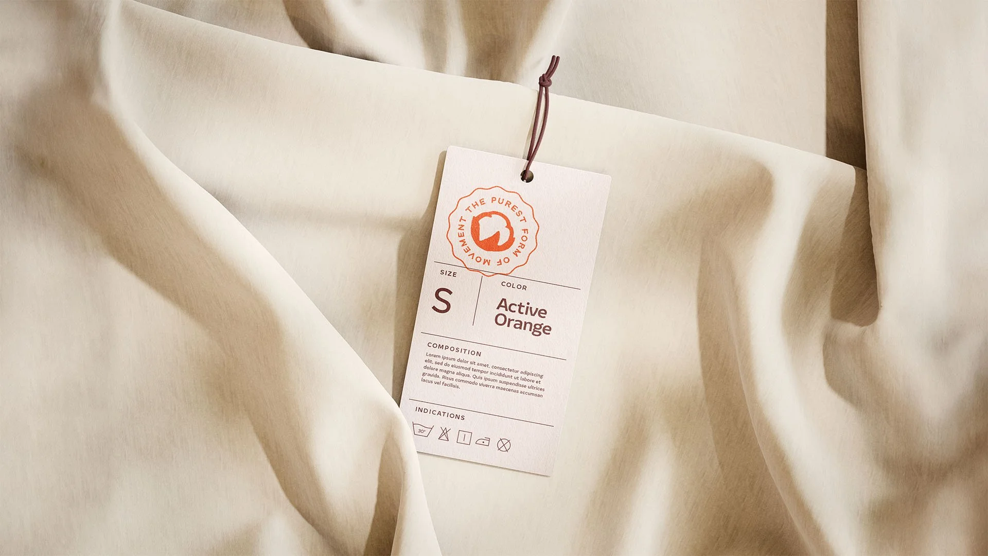
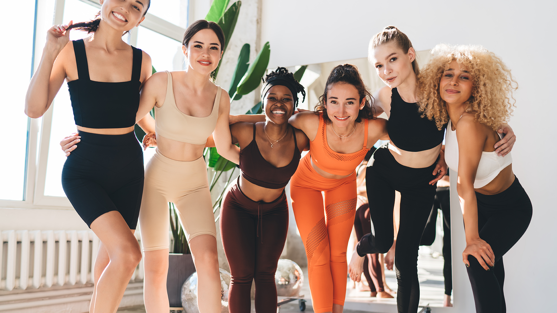
The visual identity is built on an organic palette drawn from soil and skin tones. The look and feel is innocent and considered, supporting the brand's promise of purity.
Typography
The brand typeface is the same as the wordmark for a visual consistency across diverse aplications, Amifer.
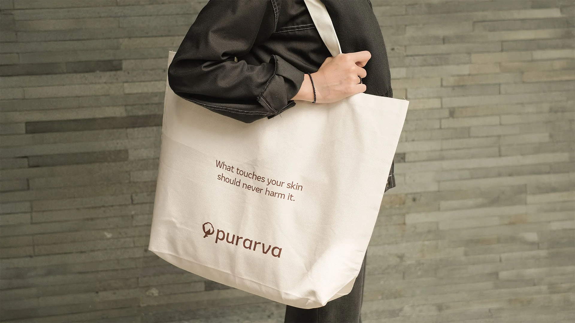
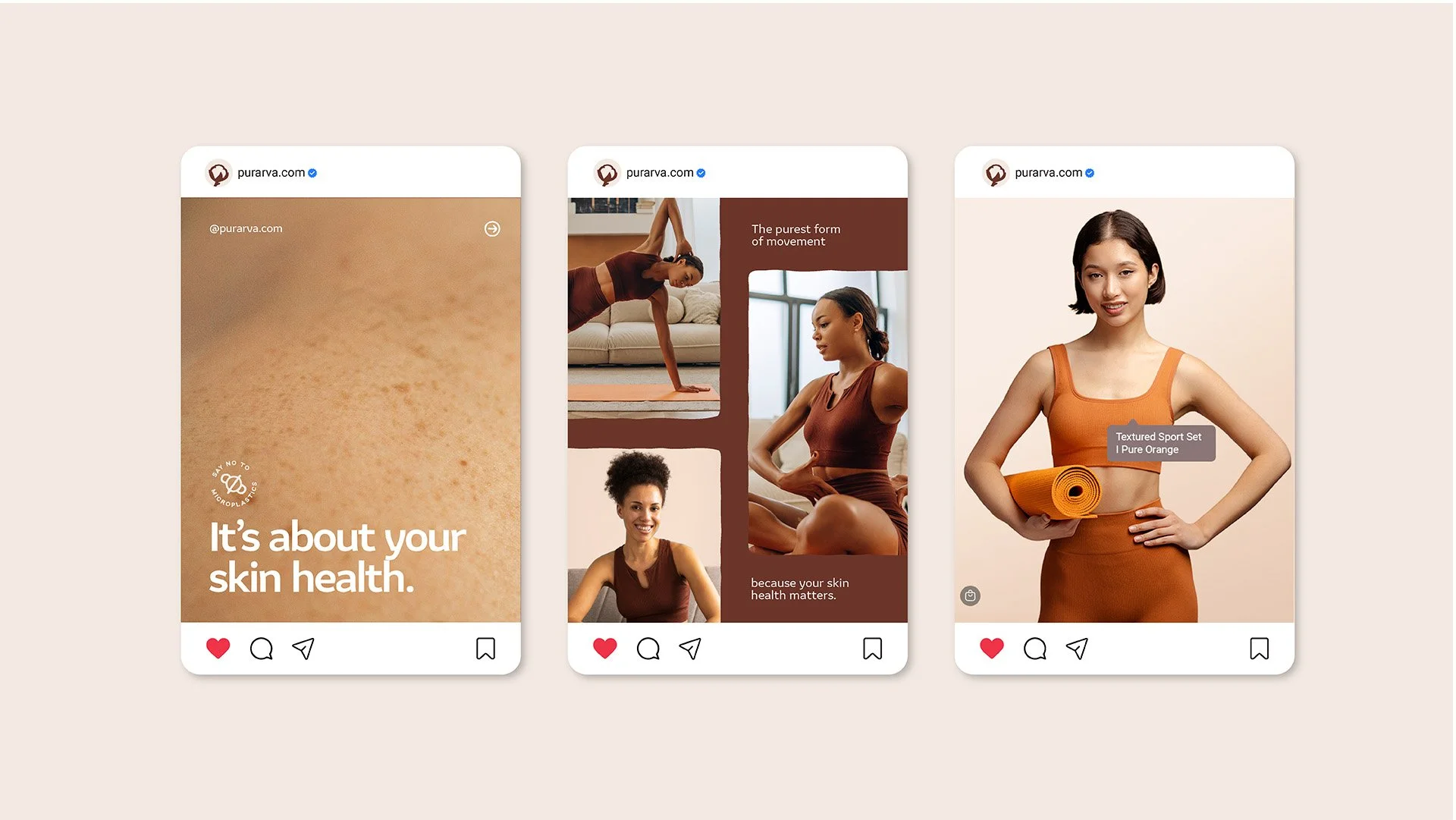
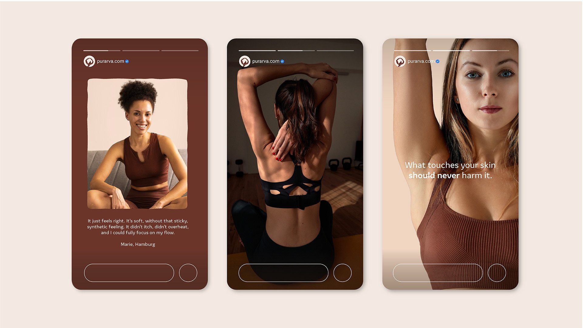
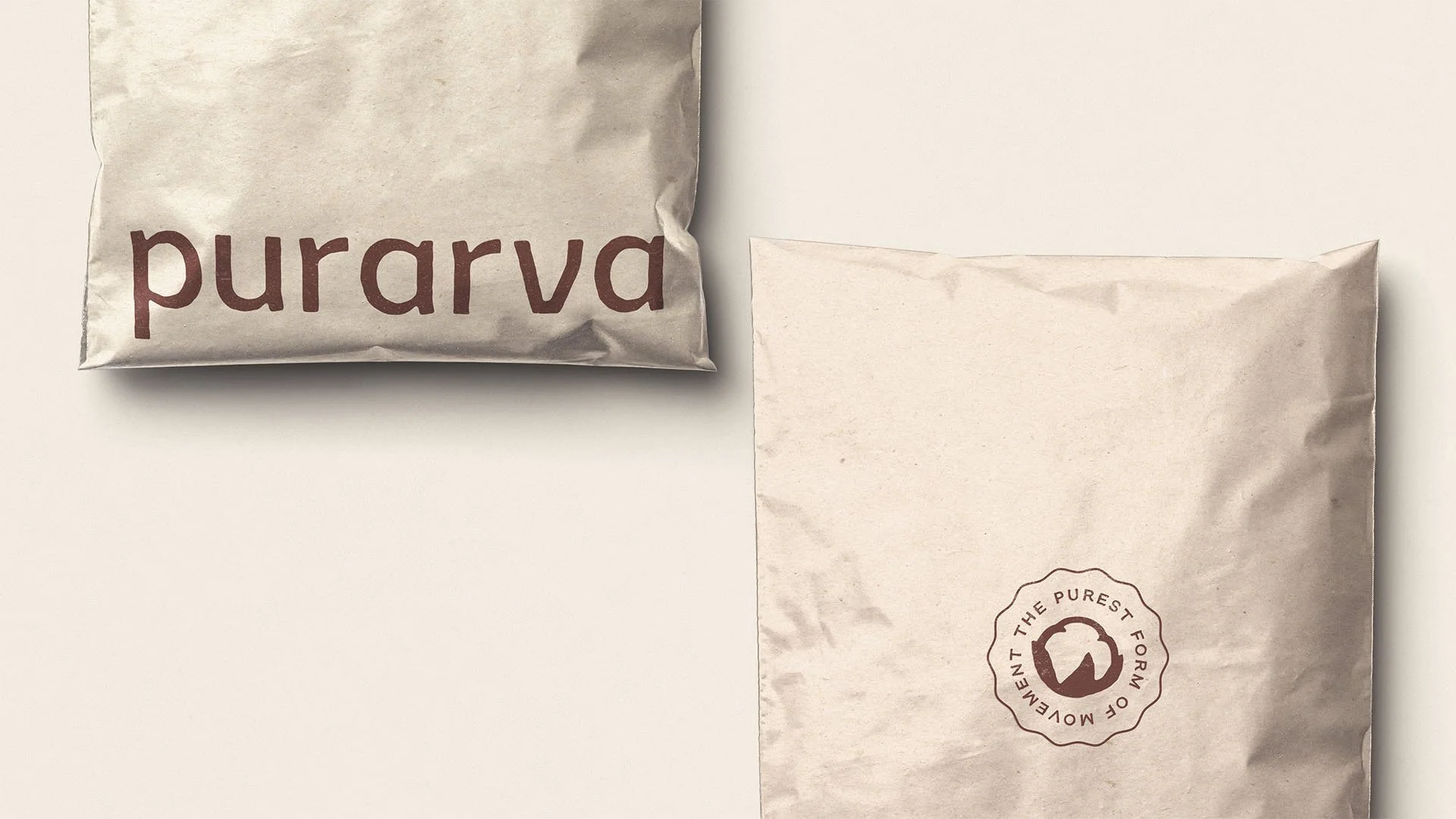
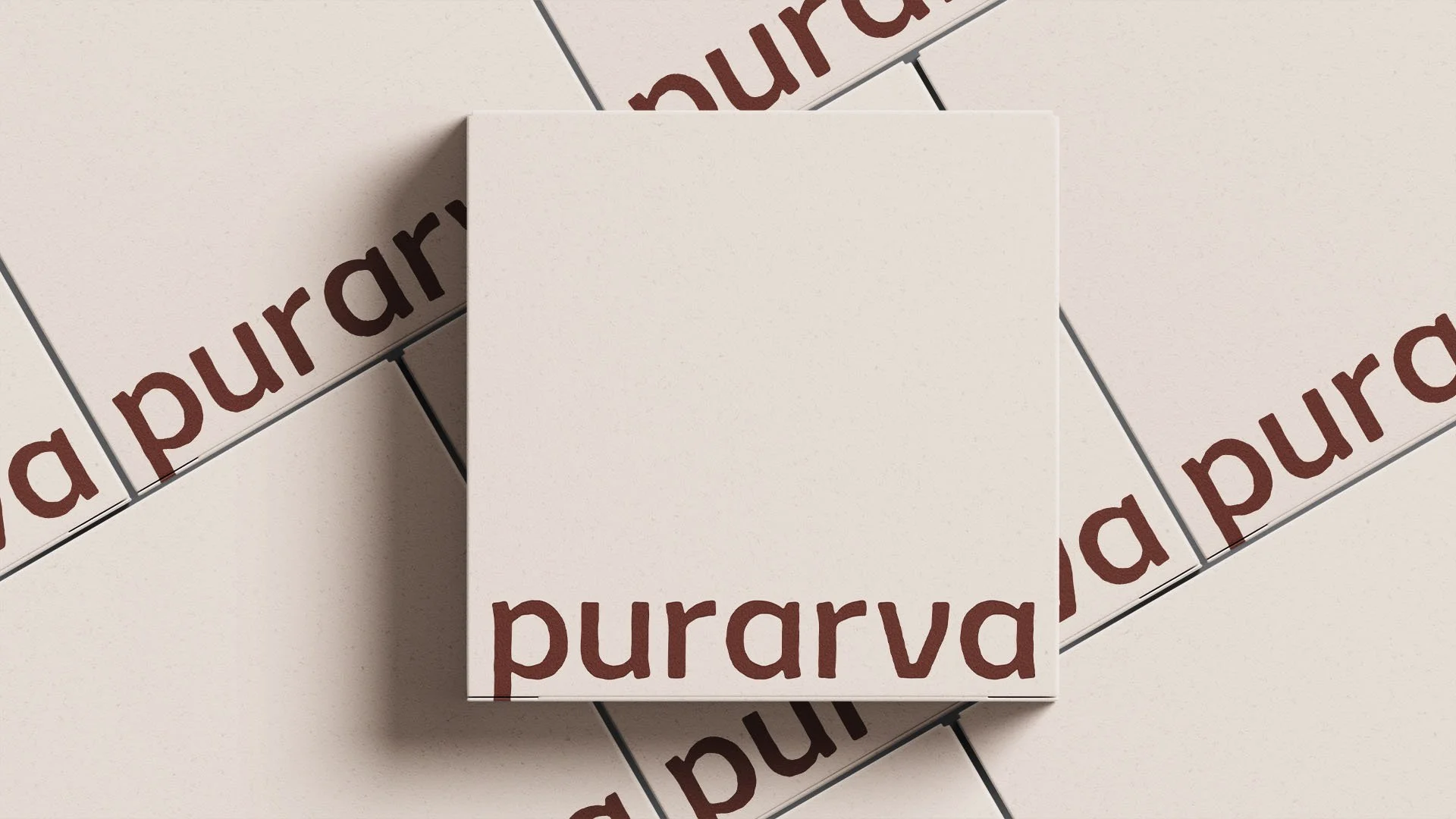
Packaging
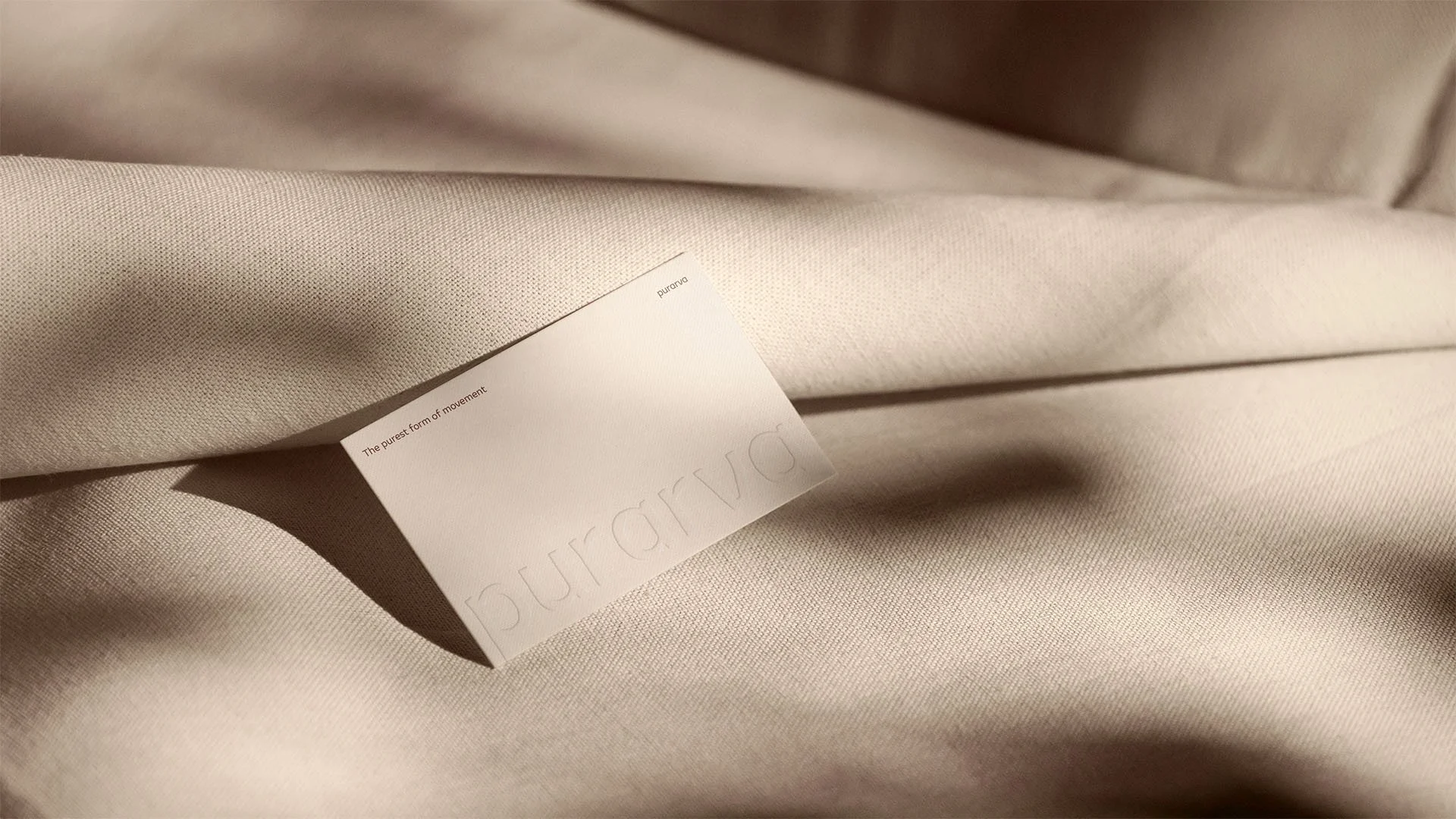
If the brand stands for purism, the packaging has to live by the same standard. Bags and cardboard boxes with minimal print. No excess, no noise. The packaging communicates the brand's mission without saying much, because brands built on purity let the material do the talking.